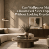


Can Wallpaper Make a Room Feel More Expensive Without Looking Overdecorated?

A room can contain expensive furniture, beautiful materials, and carefully selected accessories and still fail to feel truly luxurious.
At the same time, a relatively simple room can feel remarkably sophisticated with one thoughtful change to its walls.
What creates the difference?
Often, it is not the number of expensive things in the room. It is the way visual elements are organized.
Wallpaper can make a room feel more expensive without making it feel overdecorated because it has the ability to introduce depth, texture, proportion, rhythm, and architectural character across a large surface. When selected carefully, it can make the entire room feel more considered rather than simply more decorated.
The secret is not choosing the most dramatic wallpaper.
It is choosing a wallpaper that makes everything around it look more intentional.
Luxury Is More About Cohesion Than Excess
When people imagine a luxurious interior, they often picture elaborate furniture, metallic accents, dramatic lighting, and richly decorated walls.
But sophisticated interiors frequently work in the opposite direction.
They feel expensive because the elements appear connected.
The colors relate to one another. Materials have contrast without competing. Furniture has enough space around it. Lighting highlights important details. Decorative objects are used selectively.
Wallpaper can contribute to this sense of cohesion by giving the room a strong visual foundation.
Instead of adding another decorative object, you are transforming the largest visible surfaces in the space.
That distinction matters.
A beautifully designed wallpaper can make a room feel richer without requiring additional decoration.
Why Wallpaper Has Such a Strong Effect
Walls occupy an enormous percentage of what we see inside a room.
Paint can create color, but wallpaper can introduce several visual qualities simultaneously:
-
Color
-
Pattern
-
Texture
-
Depth
-
Repetition
-
Contrast
-
Architectural emphasis
Because these qualities cover such a large surface, even a relatively subtle wallpaper can change the overall perception of a room.
This is one reason wallpaper can sometimes make an interior feel more complete without adding more furniture or accessories.
The wall itself becomes part of the design.
Texture Is One of the Easiest Ways to Add Sophistication
Luxury is often associated with material depth.
Think about natural stone, linen, wood, leather, brushed metal, or handcrafted ceramics. These materials are visually interesting because light interacts with their surfaces.
Wallpaper can achieve a similar effect.
Embossed and textured wallcoverings create subtle variations across the wall. As natural or artificial light moves across the surface, highlights and shadows reveal the structure of the material.
This creates depth without requiring a complicated printed pattern.
A restrained textured wallpaper can therefore make a room feel richer while remaining visually quiet.
For spaces where you want sophistication without excessive decoration, texture can be more effective than adding another layer of pattern.
Expensive-Looking Does Not Mean Highly Decorative
One of the most important distinctions in luxury interior design is the difference between richness and visual excess.
A room can feel rich because of:
-
Refined texture
-
Strong proportions
-
Quality materials
-
Controlled contrast
-
Thoughtful lighting
-
Architectural details
-
Consistent color relationships
None of these require the room to be crowded.
In fact, too many decorative elements can weaken the impression of luxury by making it difficult to identify what deserves attention.
Wallpaper can help solve this problem because it can provide richness at the architectural level.
Instead of filling a wall with artwork, shelving, mirrors, and accessories, the wallpaper itself can provide visual character.
Choose Pattern According to the Room's Architecture
A wallpaper pattern becomes more sophisticated when it responds to the architecture rather than ignoring it.
Look at the proportions of the room.
Are the ceilings high?
Is the wall unusually wide?
Are there large windows?
Are there architectural niches, columns, built-ins, fireplaces, or paneling?
These characteristics can influence the appropriate scale and direction of the wallpaper.
A vertically oriented pattern can emphasize height.
A broad horizontal composition can reinforce the width of a wall.
A large-scale design can complement generous proportions.
A more restrained pattern may work better where the architecture already provides substantial visual detail.
The objective is not to cover the architecture.
It is to make the wallpaper feel as though it belongs there.
Scale Can Make Wallpaper Look More Sophisticated
Pattern scale has a major influence on perceived quality.
Very small, densely repeated motifs can sometimes create visual noise, particularly when the room already contains many details.
Large-scale patterns can feel more editorial and intentional because they create stronger visual gestures.
But large does not automatically mean luxurious.
The pattern still needs enough space to breathe.
An oversized botanical or geometric design can look elegant when the surrounding furniture and accessories are relatively restrained.
The same design can feel overwhelming if every other element in the room is equally expressive.
Luxury often comes from knowing where to stop.
Use Wallpaper to Create a Focal Point
One of the simplest ways to make wallpaper feel sophisticated is to give it a clear purpose.
Instead of asking, "Where can I put wallpaper?" ask:
"What should this room's eye notice first?"
The answer could be:
-
The wall behind a bed
-
A dining room wall
-
A fireplace wall
-
An entryway
-
A home office
-
A reading area
-
A powder room
-
A built-in architectural feature
When wallpaper has a defined visual role, it feels intentional.
This is very different from covering a wall simply because the surface feels empty.
Let the Wallpaper Do Some of the Decorating
A common mistake is adding wallpaper and then continuing to decorate the wall as though nothing changed.
A statement wallpaper may already provide enough visual information.
Adding large artwork, multiple shelves, mirrors, decorative objects, and strong accessories on top of it can make the composition feel crowded.
Instead, step back after installing the wallpaper.
Ask what the wall actually needs.
Sometimes the most luxurious choice is to leave it relatively untouched.
Negative space is not wasted space.
It gives the wallpaper room to be appreciated.
Connect Wallpaper to the Furniture—But Don't Match Everything
Wallpaper should relate to the furniture, but exact color matching is rarely necessary.
Look for subtle connections.
A warm wallpaper undertone might relate to natural oak furniture.
A deep green pattern might connect with upholstery or plants.
A soft metallic detail might echo a brushed brass light fixture.
A textured neutral wallpaper might complement linen, leather, or stone.
These relationships create cohesion without making the room look overly coordinated.
Think in terms of visual conversation, not duplication.
Contrast Can Make a Room Feel More Refined
Luxury interiors often rely on contrast.
Smooth against textured.
Dark against light.
Matte against reflective.
Soft against structured.
Wallpaper can become one of the surfaces that establishes this contrast.
For example, a deeply textured wallcovering can be paired with smooth stone and polished metal.
A subtle embossed wallpaper can sit behind sculptural furniture.
A dark wall can create contrast against pale upholstery and natural wood.
The goal is not maximum contrast.
It is meaningful contrast.
When every surface competes at the same intensity, the room loses hierarchy.
Color Depth Often Matters More Than Brightness
A sophisticated wallpaper does not necessarily need a bright or dramatic color.
Deep, complex tones can create a sense of depth without demanding excessive attention.
Consider colors such as:
-
Forest green
-
Deep navy
-
Charcoal
-
Warm taupe
-
Terracotta
-
Burgundy
-
Chocolate brown
-
Muted olive
-
Deep teal
These colors can create atmosphere because they contain visual depth.
However, even lighter colors can feel luxurious when their undertones and textures are carefully considered.
A soft ivory with subtle embossing may create more sophistication than a highly decorative metallic wall.
The quality of the surface matters as much as the intensity of the color.
Lighting Can Make Wallpaper Look More Expensive
Lighting determines how materials are perceived.
A textured or embossed wallpaper can look completely different under direct daylight compared with warm evening illumination.
Use lighting to reveal the wall rather than simply illuminate the room.
Wall washing, concealed lighting, table lamps, pendants, and carefully positioned fixtures can emphasize texture and pattern.
This is especially useful when working with premium embossed wallcoverings.
Light can reveal details that are almost invisible from a distance.
The result is a wall that changes subtly throughout the day.
That sense of dimensionality can contribute significantly to a high-end atmosphere.
Pair Wallpaper With Natural Materials
One of the easiest ways to prevent wallpaper from feeling overly decorative is to balance it with natural materials.
Wood introduces warmth.
Stone introduces solidity.
Linen creates softness.
Leather adds richness.
Ceramic introduces handcrafted character.
Metal provides controlled reflection.
Wallpaper becomes more sophisticated when it participates in this material balance.
For example, an intricate wallcovering may feel less decorative when paired with simple oak furniture and linen upholstery.
A bold geometric design can feel more architectural alongside stone and metal.
The surrounding materials help determine how the wallpaper is perceived.
Don't Make Every Surface Compete
A room feels expensive when it has hierarchy.
One element leads.
Another supports it.
The rest creates balance.
If wallpaper is the main statement, furniture can become quieter.
If a sculptural sofa is the focal point, the wallpaper may need to provide a more restrained backdrop.
If the architecture is already dramatic, a subtle textured wallcovering may be enough.
This principle can be summarized simply:
Choose what should be noticed first.
Then design everything else around that decision.
When Wallpaper Looks Overdecorated
Wallpaper itself rarely creates visual excess.
It is usually the combination of wallpaper with other strong elements that causes the problem.
Watch for these common mistakes.
Too Many Patterns
Patterned wallpaper, patterned upholstery, patterned curtains, and patterned rugs can compete for attention.
Excessive Metallic Details
Metallic wallpaper combined with multiple reflective surfaces can quickly become visually intense.
Overcrowding the Wallpapered Wall
A strong wallpaper may not need a gallery wall, oversized mirror, shelves, and accessories simultaneously.
Exact Color Matching
Repeating the wallpaper color everywhere can make the room feel staged rather than naturally coordinated.
Ignoring Proportion
A pattern that is too small or too large for the room can disrupt the visual balance.
Decorating Instead of Editing
Sometimes the room does not need another object.
It needs one object removed.
The "One Strong Move" Approach
A useful strategy for creating a sophisticated interior is to make one strong design decision and allow the rest of the room to support it.
That strong decision could be:
-
An oversized wallpaper pattern
-
A deeply textured wall
-
A dramatic color
-
An architectural feature
-
A sculptural piece of furniture
-
A distinctive lighting installation
If wallpaper is the strong move, let it have space.
This creates a sense of confidence.
The room does not need to prove that it is luxurious by showing everything at once.
Different Rooms Need Different Levels of Expression
Wallpaper does not need to behave identically throughout a home.
Living Room
A refined textured or moderately patterned wallpaper can establish atmosphere while allowing furniture to remain the focus.
Bedroom
Soft texture, restrained pattern, and deeper colors can create a more intimate environment.
Dining Room
This is a space where stronger pattern and richer color can create drama without feeling excessive.
Entryway
A more expressive wallpaper can establish personality immediately because the space is often transitional.
Powder Room
Smaller rooms can accommodate more adventurous patterns because the wallpaper can become an immersive experience.
Home Office
Structured geometric patterns or subtle textures can provide visual character without overwhelming the workspace.
The best choice depends on what the room is expected to communicate.
A Simple Formula for Expensive-Looking Wallpaper Design
If you want wallpaper to make a room feel more refined without overdecorating, consider this formula:
Intentional pattern + controlled color + tactile texture + quality materials + thoughtful lighting + visual restraint
The final element is particularly important.
Visual restraint is what allows the other elements to feel valuable.
When there is enough negative space around a beautiful material, the material becomes more noticeable.
When everything is competing, nothing feels special.
Final Thoughts
Wallpaper can absolutely make a room feel more expensive without making it feel overdecorated.
But the effect does not come simply from choosing a luxurious-looking pattern.
It comes from understanding how wallpaper interacts with architecture, furniture, lighting, materials, scale, and negative space.
The most sophisticated wallpapered interiors often have one thing in common: nothing feels unnecessary.
The wallpaper contributes something meaningful.
The furniture supports it.
The lighting reveals it.
The materials around it create contrast.
And the empty space gives everything room to breathe.
That is where wallpaper moves beyond decoration and becomes part of the architecture of the interior.
With the right pattern, texture, scale, and placement, a wall does not need to look elaborate to feel luxurious.
It simply needs to look intentional.